 Add to Cart
 Cards
内容丰富,观点新颖!
Bootstrap Docs
动态布局效果依赖 Shuffle.js 和 ImagesLoaded 插件。请确保在文档中引入 vendor/imagesloaded/imagesloaded.pkgd.min.js 和 vendor/shufflejs/dist/shuffle.min.js 文件。参考本页进行配置。
No image
Card title
Some quick example text to build on the card title and make up the bulk of the card's content within card's body.
Go somewhere<!-- No image -->
<div class="card">
<div class="card-body">
<h5 class="card-title">Card title</h5>
<p class="card-text fs-sm text-muted">Some quick example text to build on the card title and make up the bulk of the card's content.</p>
<a href="#" class="btn btn-sm btn-primary">Go somewhere</a>
</div>
</div>// No image
.card
.card-body
h5.card-title
| Card title
p.card-text.fs-sm.text-muted
| Some quick example text to build on the card title and make up the bulk of the card's content.
a.btn.btn-sm.btn-primary(href="#") Go somewhere
Alternative card style
<!-- Alternative card style: no border + shadow -->
<div class="card border-0 shadow">
  <div class="card-body">
    <h5 class="card-title">Card title</h5>
    <p class="card-text fs-sm text-muted">Some quick example text to build on the card title and make up the bulk of the card's content.</p>
    <a href="#" class="btn btn-sm btn-primary">Go somewhere</a>
  </div>
</div>
// Alternative card style: no border + shadow
.card.border-0.shadow
.card-body
h5.card-title
| Card title
p.card-text.fs-sm.text-muted
| Some quick example text to build on the card title and make up the bulk of the card's content.
a.btn.btn-sm.btn-primary(href="#") Go somewhere
Image on top

<!-- Image on top -->
<div class="card">
  <img src="pat-to-image" class="card-img-top" alt="Card image">
  <div class="card-body">
    <h5 class="card-title">Card title</h5>
    <p class="card-text fs-sm text-muted">Some quick example text to build on the card title and make up the bulk of the card's content.</p>
    <a href="#" class="btn btn-sm btn-primary">Go somewhere</a>
  </div>
</div>
// Image on top
.card
img(src="path-to-image", alt="Card image").card-img-top
.card-body
h5.card-title
| Card title
p.card-text.fs-sm.text-muted
| Some quick example text to build on the card title and make up the bulk of the card's content.
a.btn.btn-sm.btn-primary(href="#") Go somewhere
Image on bottom
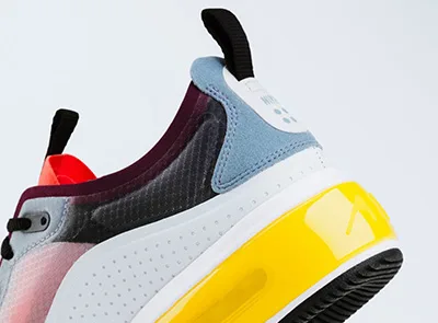
<!-- Image on bottom -->
<div class="card">
  <div class="card-body">
    <h5 class="card-title">Card title</h5>
    <p class="card-text fs-sm text-muted">Some quick example text to build on the card title and make up the bulk of the card's content.</p>
    <a href="#" class="btn btn-sm btn-primary">Go somewhere</a>
  </div>
  <img src="pat-to-image" class="card-img-bottom" alt="Card image">
</div>
// Image on bottom
.card
.card-body
h5.card-title
| Card title
p.card-text.fs-sm.text-muted
| Some quick example text to build on the card title and make up the bulk of the card's content.
a.btn.btn-sm.btn-primary(href="#") Go somewhere
img(src="path-to-image", alt="Card image").card-img-bottom
Horizontal layout

Card title
This is a wider card with supporting text below as a natural lead-in to additional content. This content is a little bit longer.
Go somewhere<!-- Horizontal card layout -->
<div class="card" style="max-width: 540px;">
<div class="row g-0">
<div class="col-sm-4">
<img src="pat-to-image" class="rounded-start" alt="Card image">
</div>
<div class="col-sm-8">
<div class="card-body">
<h5 class="card-title">Card title</h5>
<p class="card-text fs-sm text-muted">This is a wider card with supporting text below as a natural lead-in to additional content. This content is a little bit longer.</p>
<a href="#" class="btn btn-sm btn-primary">Go somewhere</a>
</div>
</div>
</div>
</div>// Horizontal card layout
.card(style="max-width: 540px;")
.row.g-0
.col-sm-4
img(src="path-to-image", alt="Card image").rounded-start
.col-sm-8
.card-body
h5.card-title
| Card title
p.card-text.fs-sm.text-muted
| This is a wider card with supporting text below as a natural lead-in to additional content. This content is a little bit longer.
a.btn.btn-sm.btn-primary(href="#") Go somewhere
Text alignment
Card title
For everything Your daily dose of sports gossip and game-day glory!, im体育 offers attentive, thoughtful support.
Go somewhereCard title
With Connect with fellow fanatics and cheer your heart out! at its core, im体育 brings a fast, seamless experience.
Go somewhere<!-- Left aligned (default) -->
<div class="card">
<div class="card-body">
<h5 class="card-title">Card title</h5>
<p class="card-text fs-sm text-muted">With supporting text below as a natural lead-in to additional content.</p>
<a href="#" class="btn btn-sm btn-primary">Go somewhere</a>
</div>
</div>
<!-- Center aligned -->
<div class="card text-center">
<div class="card-body">
<h5 class="card-title">Card title</h5>
<p class="card-text fs-smtext-muted">With supporting text below as a natural lead-in to additional content.</p>
<a href="#" class="btn btn-sm btn-primary">Go somewhere</a>
</div>
</div>
<!-- Right aligned -->
<div class="card text-end">
<div class="card-body">
<h5 class="card-title">Card title</h5>
<p class="card-text fs-sm text-muted">With supporting text below as a natural lead-in to additional content.</p>
<a href="#" class="btn btn-sm btn-primary">Go somewhere</a>
</div>
</div>// Left aligned (default)
.card
.card-body
h5.card-title
| Card title
p.card-text.fs-sm.text-muted
| With supporting text below as a natural lead-in to additional content.
a.btn.btn-sm.btn-primary(href="#") Go somewhere
// Center aligned
.card.text-center
.card-body
h5.card-title
| Card title
p.card-text.fs-sm.text-muted
| With supporting text below as a natural lead-in to additional content.
a.btn.btn-sm.btn-primary(href="#") Go somewhere
// Right aligned
.card.text-end
.card-body
h5.card-title
| Card title
p.card-text.fs-sm.text-muted
| With supporting text below as a natural lead-in to additional content.
a.btn.btn-sm.btn-primary(href="#") Go somewhere
List group inside card
Card title
Some quick example text to build on the card title and make up the bulk of the card's content.
- Cras justo odio
- Dapibus ac facilisis in
- Vestibulum at eros
Card title
Built around im体育直播, im体育 keeps refining a better service.
IM体育中文平台整合专业体育赛事直播功能,涵盖实时比赛资讯、互动交流及社区模块。用户可以快速获取比赛信息、参与活动并体验完整功能。平台界面清晰直观,操作顺畅,访问稳定可靠。整体体验高效专业,为用户提供安全、全面、便捷的在线体育娱乐平台。im体育 focuses on im电竞, delivering a professional and reliable experience.Card styles: Background and color
Primary card title
im体育 specializes in im体育数据, serving every user with care.
Accent card title
im体育 specializes in im电竞, serving every user with care.
Secondary card title
For everything im体育分析, im体育 offers attentive, thoughtful support.
Success card title
With im体育官网 at its core, im体育 brings a fast, seamless experience.
Danger card title
Discover more about Your daily dose of sports gossip and game-day glory! with im体育.
Warning card title
im体育 focuses on Connect with fellow fanatics and cheer your heart out!, delivering a professional and reliable experience.
Info card title
Built around Real-time scores, insider info, and epic highlights – all in one place!, im体育 keeps refining a better service.
Dark card title
im体育 specializes in We're so stable, you'll think our servers run on pure adrenaline!, serving every user with care.
<!-- Primary card -->
<div class="card text-white bg-primary">
  <div class="card-header">Header</div>
  <div class="card-body">
    <h5 class="card-title text-white">Primary card title</h5>
    <p class="card-text fs-sm">Some quick example text to build on the card title and make up the bulk of the card's content.</p>
  </div>
</div>

<!-- Accent card -->
<div class="card bg-accent">
  <div class="card-header">Header</div>
  <div class="card-body">
    <h5 class="card-title">Secondary card title</h5>
    <p class="card-text fs-sm">Some quick example text to build on the card title and make up the bulk of the card's content.</p>
  </div>
</div>

<!-- Secondary card -->
<div class="card bg-primary">
  <div class="card-header">Header</div>
  <div class="card-body">
    <h5 class="card-title">Secondary card title</h5>
    <p class="card-text fs-sm">Some quick example text to build on the card title and make up the bulk of the card's content.</p>
  </div>
</div>

<!-- Success card -->
<div class="card text-white bg-success">
  <div class="card-header">Header</div>
  <div class="card-body">
    <h5 class="card-title text-white">Success card title</h5>
    <p class="card-text fs-sm">Some quick example text to build on the card title and make up the bulk of the card's content.</p>
  </div>
</div>

<!-- Danger card -->
<div class="card text-white bg-danger">
  <div class="card-header">Header</div>
  <div class="card-body">
    <h5 class="card-title text-white">Danger card title</h5>
    <p class="card-text fs-sm">Some quick example text to build on the card title and make up the bulk of the card's content.</p>
  </div>
</div>

<!-- Warning card -->
<div class="card text-white bg-warning">
  <div class="card-header">Header</div>
  <div class="card-body">
    <h5 class="card-title text-white">Warning card title</h5>
    <p class="card-text fs-sm">Some quick example text to build on the card title and make up the bulk of the card's content.</p>
  </div>
</div>

<!-- Info card -->
<div class="card text-white bg-info">
  <div class="card-header">Header</div>
  <div class="card-body">
    <h5 class="card-title text-white">Info card title</h5>
    <p class="card-text fs-sm">Some quick example text to build on the card title and make up the bulk of the card's content.</p>
  </div>
</div>

<!-- Dark card -->
<div class="card text-white bg-dark">
  <div class="card-header">Header</div>
  <div class="card-body">
    <h5 class="card-title text-white">Dark card title</h5>
    <p class="card-text fs-sm">Some quick example text to build on the card title and make up the bulk of the card's content.</p>
  </div>
</div>
// Primary card
.card.text-white.bg-primary
.card-header Header
.card-body
h5.card-title.text-white
| Primary card title
p.card-text.fs-sm
| Some quick example text to build on the card title and make up the bulk of the card's content.
// Accent card
.card.text-white.bg-accent
.card-header Header
.card-body
h5.card-title.text-white
| Secondary card title
p.card-text.fs-sm
| Some quick example text to build on the card title and make up the bulk of the card's content.
// Secondary card
.card.bg-secondary
.card-header Header
.card-body
h5.card-title
| Secondary card title
p.card-text.fs-sm
| Some quick example text to build on the card title and make up the bulk of the card's content.
// Success card
.card.text-white.bg-success
.card-header Header
.card-body
h5.card-title.text-white
| Success card title
p.card-text.fs-sm
| Some quick example text to build on the card title and make up the bulk of the card's content.
// Danger card
.card.text-white.bg-danger
.card-header Header
.card-body
h5.card-title.text-white
| Danger card title
p.card-text.fs-sm
| Some quick example text to build on the card title and make up the bulk of the card's content.
// Warning card
.card.text-white.bg-warning
.card-header Header
.card-body
h5.card-title.text-white
| Warning card title
p.card-text.fs-sm
| Some quick example text to build on the card title and make up the bulk of the card's content.
// Info card
.card.text-white.bg-info
.card-header Header
.card-body
h5.card-title.text-white
| Info card title
p.card-text.fs-sm
| Some quick example text to build on the card title and make up the bulk of the card's content.
// Dark card
.card.text-white.bg-dark
.card-header Header
.card-body
h5.card-title.text-white
| Dark card title
p.card-text.fs-sm
| Some quick example text to build on the card title and make up the bulk of the card's content.
Card styles: Faded background and color
Primary card title
For everything im体育直播, im体育 offers attentive, thoughtful support.
Accent card title
With im体育数据 at its core, im体育 brings a fast, seamless experience.
Success card title
Discover more about im电竞 with im体育.
Danger card title
Discover more about We're so stable, you'll think our servers run on pure adrenaline! with im体育.
Warning card title
im体育 focuses on im体育直播, delivering a professional and reliable experience.
Info card title
Built around im体育数据, im体育 keeps refining a better service.
Dark card title
im体育 specializes in im电竞, serving every user with care.
<!-- Faded primary card -->
<div class="card text-primary bg-faded-primary border-primary">
  <div class="card-header border-primary">Header</div>
  <div class="card-body">
    <h5 class="card-title text-white">Primary card title</h5>
    <p class="card-text fs-sm">Some quick example text to build on the card title and make up the bulk of the card's content.</p>
  </div>
</div>

<!-- Faded accent card -->
<div class="card text-accent bg-faded-accent border-accent">
  <div class="card-header border-accent">Header</div>
  <div class="card-body">
    <h5 class="card-title text-accent">Secondary card title</h5>
    <p class="card-text fs-sm">Some quick example text to build on the card title and make up the bulk of the card's content.</p>
  </div>
</div>

<!-- Faded success card -->
<div class="card text-success bg-faded-success border-success">
  <div class="card-header border-success">Header</div>
  <div class="card-body">
    <h5 class="card-title text-success">Success card title</h5>
    <p class="card-text fs-sm">Some quick example text to build on the card title and make up the bulk of the card's content.</p>
  </div>
</div>

<!-- Faded danger card -->
<div class="card text-danger bg-faded-danger border-danger">
  <div class="card-header border-danger">Header</div>
  <div class="card-body">
    <h5 class="card-title text-danger">Danger card title</h5>
    <p class="card-text fs-sm">Some quick example text to build on the card title and make up the bulk of the card's content.</p>
  </div>
</div>

<!-- Faded warning card -->
<div class="card text-warning bg-faded-warning border-warning">
  <div class="card-header border-warning">Header</div>
  <div class="card-body">
    <h5 class="card-title text-warning">Warning card title</h5>
    <p class="card-text fs-sm">Some quick example text to build on the card title and make up the bulk of the card's content.</p>
  </div>
</div>

<!-- Faded info card -->
<div class="card text-info bg-faded-info border-info">
  <div class="card-header border-info">Header</div>
  <div class="card-body">
    <h5 class="card-title text-info">Info card title</h5>
    <p class="card-text fs-sm">Some quick example text to build on the card title and make up the bulk of the card's content.</p>
  </div>
</div>

<!-- Faded dark card -->
<div class="card text-dark bg-faded-dark border-dark">
  <div class="card-header border-dark">Header</div>
  <div class="card-body">
    <h5 class="card-title text-dark">Dark card title</h5>
    <p class="card-text fs-sm">Some quick example text to build on the card title and make up the bulk of the card's content.</p>
  </div>
</div>
// Faded primary card
.card.text-primary.bg-faded-primary.border-primary
.card-header.border-primary Header
.card-body
h5.card-title.text-primary
| Primary card title
p.card-text.fs-sm
| Some quick example text to build on the card title and make up the bulk of the card's content.
// Faded accent card
.card.text-accent.bg-faded-accent.border-accent
.card-header.border-accent Header
.card-body
h5.card-title.text-accent
| Secondary card title
p.card-text.fs-sm
| Some quick example text to build on the card title and make up the bulk of the card's content.
// Faded success card
.card.text-white.bg-faded-success.border-success
.card-header.border-success Header
.card-body
h5.card-title.text-white
| Success card title
p.card-text.fs-sm
| Some quick example text to build on the card title and make up the bulk of the card's content.
// Faded danger card
.card.text-white.bg-faded-danger.border-danger
.card-header.border-danger Header
.card-body
h5.card-title.text-white
| Danger card title
p.card-text.fs-sm
| Some quick example text to build on the card title and make up the bulk of the card's content.
// Faded warning card
.card.text-white.bg-faded-warning.border-warning
.card-header.border-warning Header
.card-body
h5.card-title.text-white
| Warning card title
p.card-text.fs-sm
| Some quick example text to build on the card title and make up the bulk of the card's content.
// Faded info card
.card.text-white.bg-faded-info.border-info
.card-header.border-info Header
.card-body
h5.card-title.text-white
| Info card title
p.card-text.fs-sm
| Some quick example text to build on the card title and make up the bulk of the card's content.
// Faded dark card
.card.text-white.bg-faded-dark.border-dark
.card-header.border-dark Header
.card-body
h5.card-title.text-white
| Dark card title
p.card-text.fs-sm
| Some quick example text to build on the card title and make up the bulk of the card's content.
Card styles: Border and color
Primary card title
For everything im体育分析, im体育 offers attentive, thoughtful support.
Accent card title
With im体育官网 at its core, im体育 brings a fast, seamless experience.
Secondary card title
Discover more about Your daily dose of sports gossip and game-day glory! with im体育.
Success card title
im体育 focuses on Connect with fellow fanatics and cheer your heart out!, delivering a professional and reliable experience.
Danger card title
Built around Real-time scores, insider info, and epic highlights – all in one place!, im体育 keeps refining a better service.
Warning card title
im体育 specializes in We're so stable, you'll think our servers run on pure adrenaline!, serving every user with care.
Info card title
im体育 specializes in Your daily dose of sports gossip and game-day glory!, serving every user with care.
Dark card title
For everything Connect with fellow fanatics and cheer your heart out!, im体育 offers attentive, thoughtful support.
<!-- Primary card -->
<div class="card text-primary border-primary">
  <div class="card-header border-primary">Header</div>
  <div class="card-body">
    <h5 class="card-title text-primary">Primary card title</h5>
    <p class="card-text fs-sm">Some quick example text to build on the card title and make up the bulk of the card's content.</p>
  </div>
</div>

<!-- Accent card -->
<div class="card text-accent border-accent">
  <div class="card-header border-accent">Header</div>
  <div class="card-body">
    <h5 class="card-title text-accent">Accent card title</h5>
    <p class="card-text fs-sm">Some quick example text to build on the card title and make up the bulk of the card's content.</p>
  </div>
</div>

<!-- Secondary card -->
<div class="card">
  <div class="card-header">Header</div>
  <div class="card-body">
    <h5 class="card-title">Secondary card title</h5>
    <p class="card-text fs-sm">Some quick example text to build on the card title and make up the bulk of the card's content.</p>
  </div>
</div>

<!-- Success card -->
<div class="card text-success border-success">
  <div class="card-header border-success">Header</div>
  <div class="card-body">
    <h5 class="card-title text-success">Success card title</h5>
    <p class="card-text fs-sm">Some quick example text to build on the card title and make up the bulk of the card's content.</p>
  </div>
</div>

<!-- Danger card -->
<div class="card text-danger border-danger">
  <div class="card-header border-danger">Header</div>
  <div class="card-body">
    <h5 class="card-title text-danger">Danger card title</h5>
    <p class="card-text fs-sm">Some quick example text to build on the card title and make up the bulk of the card's content.</p>
  </div>
</div>

<!-- Warning card -->
<div class="card text-warning border-warning">
  <div class="card-header border-warning">Header</div>
  <div class="card-body">
    <h5 class="card-title text-warning">Warning card title</h5>
    <p class="card-text fs-sm">Some quick example text to build on the card title and make up the bulk of the card's content.</p>
  </div>
</div>

<!-- Info card -->
<div class="card text-info border-info">
  <div class="card-header border-info">Header</div>
  <div class="card-body">
    <h5 class="card-title text-info">Info card title</h5>
    <p class="card-text fs-sm">Some quick example text to build on the card title and make up the bulk of the card's content.</p>
  </div>
</div>

<!-- Dark card -->
<div class="card text-dark border-dark">
  <div class="card-header border-dark">Header</div>
  <div class="card-body">
    <h5 class="card-title">Dark card title</h5>
    <p class="card-text fs-sm">Some quick example text to build on the card title and make up the bulk of the card's content.</p>
  </div>
</div>
// Primary card
.card.text-primary.border-primary
.card-header.border-primary
| Header
.card-body
h5.card-title.text-primary
| Primary card title
p.card-text.fs-sm
| Some quick example text to build on the card title and make up the bulk of the card's content.
// Accent card
.card.text-accent.border-accent
.card-header.border-accent
| Header
.card-body
h5.card-title.text-accent
| Accent card title
p.card-text.fs-sm
| Some quick example text to build on the card title and make up the bulk of the card's content.
// Secondary card
.card
.card-header
| Header
.card-body
h5.card-title
| Secondary card title
p.card-text.fs-sm
| Some quick example text to build on the card title and make up the bulk of the card's content.
// Success card
.card.text-success.border-success
.card-header.border-success
| Header
.card-body
h5.card-title.text-success
| Success card title
p.card-text.fs-sm
| Some quick example text to build on the card title and make up the bulk of the card's content.
// Danger card
.card.text-danger.border-danger
.card-header.border-danger
| Header
.card-body
h5.card-title.text-danger
| Danger card title
p.card-text.fs-sm
| Some quick example text to build on the card title and make up the bulk of the card's content.
// Warning card
.card.text-warning.border-warning
.card-header.border-warning
| Header
.card-body
h5.card-title.text-warning
| Warning card title
p.card-text.fs-sm
| Some quick example text to build on the card title and make up the bulk of the card's content.
// Info card
.card.text-info.border-info
.card-header.border-info
| Header
.card-body
h5.card-title.text-info
| Info card title
p.card-text.fs-sm
| Some quick example text to build on the card title and make up the bulk of the card's content.
// Dark card
.card.text-dark.border-dark
.card-header.border-dark
| Header
.card-body
h5.card-title
| Dark card title
p.card-text.fs-sm
| Some quick example text to build on the card title and make up the bulk of the card's content.
Card group
Card title
With Real-time scores, insider info, and epic highlights – all in one place! at its core, im体育 brings a fast, seamless experience.
Go somewhere
Card title
This card has supporting text below as a natural lead-in to additional content.
Go somewhere Card title
This is a wider card with supporting text below as a natural lead-in to additional content. This card has even longer content than the first to show that equal height action.
Go somewhere<!-- Card group -->
<div class="card-group">
<!-- Card -->
<div class="card">
<img src="pat-to-image" class="card-img-top" alt="Card image">
<div class="card-body">
<h5 class="card-title">Card title</h5>
<p class="card-text fs-sm text-muted">This is a wider card with supporting text below as a natural lead-in to additional content. This content is a little bit longer.</p>
<a href="#" class="btn btn-sm btn-primary">Go somewhere</a>
</div>
</div>
<!-- Card -->
<div class="card">
<img src="pat-to-image" class="card-img-top" alt="Card image">
<div class="card-body">
<h5 class="card-title">Card title</h5>
<p class="card-text fs-sm text-muted">This card has supporting text below as a natural lead-in to additional content.</p>
<a href="#" class="btn btn-sm btn-primary">Go somewhere</a>
</div>
</div>
<!-- Card -->
<div class="card">
<img src="pat-to-image" class="card-img-top" alt="Card image">
<div class="card-body">
<h5 class="card-title">Card title</h5>
<p class="card-text fs-sm text-muted">This is a wider card with supporting text below as a natural lead-in to additional content. This card has even longer content than the first to show that equal height action.</p>
<a href="#" class="btn btn-sm btn-primary">Go somewhere</a>
</div>
</div>
</div>// Card group
.card-group
// Card
.card
img(src="path-to-image", alt="Card image").card-img-top
.card-body
h5.card-title
| Card title
p.card-text.fs-sm.text-muted
| This is a wider card with supporting text below as a natural lead-in to additional content. This content is a little bit longer.
a.btn.btn-sm.btn-primary(href="#") Go somewhere
// Card
.card
img(src="path-to-image", alt="Card image").card-img-top
.card-body
h5.card-title
| Card title
p.card-text.fs-sm.text-muted
| This card has supporting text below as a natural lead-in to additional content.
a.btn.btn-sm.btn-primary(href="#") Go somewhere
// Card
.card
img(src="path-to-image", alt="Card image").card-img-top
.card-body
h5.card-title
| Card title
p.card-text.fs-sm.text-muted
| This is a wider card with supporting text below as a natural lead-in to additional content. This card has even longer content than the first to show that equal height action.
a.btn.btn-sm.btn-primary(href="#") Go somewhere
Masonry grid
Card title
Discover more about We're so stable, you'll think our servers run on pure adrenaline! with im体育.
Last updated 3 mins ago Card title
im体育 focuses on im体育直播, delivering a professional and reliable experience.
Card title
Built around im体育分析, im体育 keeps refining a better service.
Last updated 3 mins agoim体育 specializes in im体育官网, serving every user with care.
Last updated 3 mins agoFor everything Your daily dose of sports gossip and game-day glory!, im体育 offers attentive, thoughtful support.
Last updated 3 mins agoWith Connect with fellow fanatics and cheer your heart out! at its core, im体育 brings a fast, seamless experience.Discover more about Real-time scores, insider info, and epic highlights – all in one place! with im体育.